5 E-learning User Interface to Improve Learning Experience
Graphical User Interface (GUI) enables participants to interact with e-learning courses through graphical element.
Here below are few GUI templates to reduce time for your next eLearning course development process.
Graphical User Interface: Template-009
This Articulate Storyline e learning course design template is basically an interactive interface that can help any learner to get acquainted with the different aspects of the interface and which button corresponds to which function or how to navigate through the course.
The logo holder and title holder are placed along with back and forth navigation buttons at the bottom of the slide. The slide title has the word navigation written on top left corner of the slide and the course navigation buttons are placed on the top right hand corner of the GUI. The center of the slide has a text placeholder at present which consists of descriptive texts relating to the course navigation buttons with arrow pointers on the right pointing out the buttons which it is describing. The left hand space is allotted for graphic image.
Graphical User Interface: Template-010
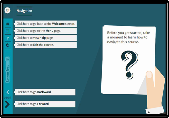
This is another style of Articulate Storyline interface which helps the first time learners to get acquainted with the various aspect of the course and the various buttons in the template.
The background of the template has a dark aquamarine colour while the left side has a bar which has a lighter shade of the aquamarine colour. There is a logo placeholder on top of the bar. The list of buttons are placed on the bar vertically. There is a provision for the course below the tab buttons, and the course navigation buttons are placed even below the title name. The title of slide is written just beside the logo place holder. There are text placeholders containing explanatory texts beside each of the tab button and navigation buttons. On the right hand side of the screen, there is an info graphic depicting a hand holding a piece of paper with an interrogation mark on the paper.
First timers using the course may find helpful as this interface effectively guides the learners through the navigation process of the course.
Designers, who have an eye for colour may find this interface very attractive and eyeball grabbing.
Graphical User Interface: Template-011
This Graphical User Interface has absolutely a simplistic design. The GUI template does not have much intricacy. Hence this text placeholder is apt for presenting a content, summary of the course or may be the results of a quiz at the end of the course.
The screen appears to have a course title place holder at the top which is centrally aligned. Beside it are placed the Help button and the Exit button. Below the course title, there is another bar with provisions for content heading and logo placeholder. The background colour of the slide holder is white while there are two Back and Next navigation buttons placed on the right and left side of the slide to navigate.
Graphical User Interface: Template-012
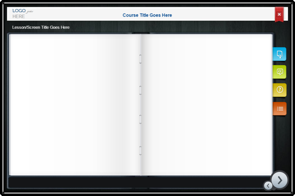
This Graphical User Interface template is a very effective interface. It allows the learners to download the contents, so for any content that requires a download for the benefit of the learners, this is an apt interface. Moreover, this interface also allows for closed captioning (CC).
This interface has a very basic styling pattern with logo place holder and title holder placed at the top of the screen. The top right hand corner has the exit button in place. The download button, closed captioning button, menu button and the help button are all lined vertically on the right hand side of screen with the navigation buttons being placed on the bottom right hand corner of the screen.
The navigation buttons come in attractive colour, while the background of the screen is white in colour imparting a professional look to the slide.
Graphical User Interface: Template-013
This Graphical User Interface is user friendly and visually appealing, which has a simplistic design yet the colour combination adds to its aestheticism.
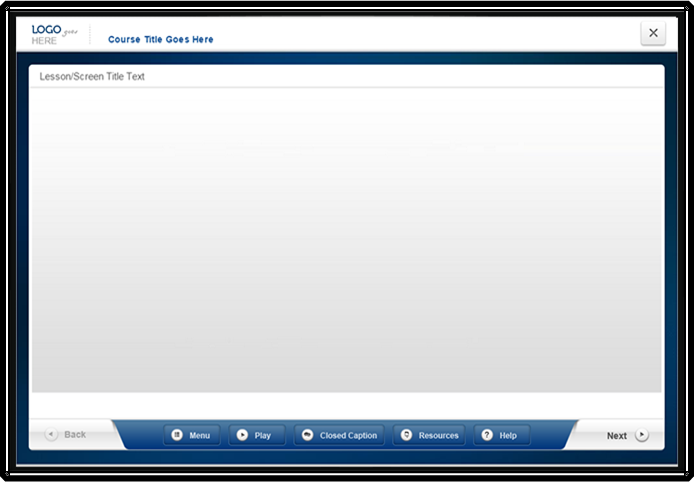
The screen shows a title bar with logo placeholder on the top most part of the screen. The navigation buttons and the tab buttons are placed on the bar at the bottom of the screen. The extra feature that this slide holder offers is the Play/pause button allowing for audio or video content to be placed in the interface adding to the interactivity quotient of the course.
So in case, a course or a concept requires an audio or video clipping to be placed in the content for the benefit of the learners, this interface is the one that can be used. The basic white background with navy blue borders makes it a very crisp looking interface which would support contents having any coloured backgrounds along with video or audio clippings.
This GUIs being designed on Articulate Storyline 3, any course designed on this interfaces is much more accessible to learners. This interface has compatibility to devices like the desktop, iPad, iPhone, mobile devices such as android and IOS devices etc… Hence it allows the learners to continue their learning process anytime anywhere.
Create a Free Account and get access for unlimited templates
Our Services: Powerpoint to eLearning, Flash to HTML5 Migration, eLearning Service Provider


Leave a Reply
Want to join the discussion?Feel free to contribute!