Simplification of eLearning Design for Effective Course Content
The main purpose of eLearning courses is to make the training material (or learning) as simple as possible for the students rather than giving all sorts of irrelevant information. You need to put in relevant information, and make sure it does not cross the human brain’s capacity to understand and be able to store all that. Improving the quality of the eLearning content is a major hurdle faced by all designers. Well, here is one rule that can help you do it – “Keep it Simple”.
Simplicity in your eLearning design helps you impart the information in the easiest way possible. The content gets lost if you clutter too many details. Less information is always more. It is an art to be able to keep it simple.
Here are some tips to keep your eLearning courses simple yet effective:
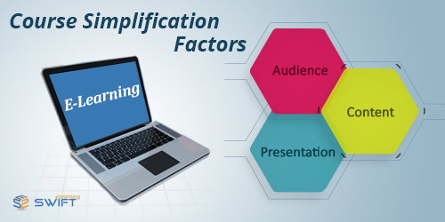
Understand the audience you want to target: You need to understand your audience for the eLearning courses while you make your eLearning design. This makes the readers more engaged while they go through it. It helps you put the focus on the relevant details only. Not understanding your audience is the first step at failing in your course design.
Maintain your focus on what is most important: The developers should focus on the most important aspects of the course to be able to make it as good as possible. By making a simple course, the learners receive only as much material as they will be able to understand and absorb. This is the most important part for a developer. Going overboard with the content complicates the whole process of eLearning. Take out only the relevant details to include in your content, and drop the rest. This ensures that your students enjoy learning rather than getting bored or bombarded with too much. They have only limited time, and you need to impart as much as possible within this time limit. So, include only what is essential.
Make judicious use of white spaces: White spaces make sure the screens are not too cluttered, and look free. Learners get confused if there is too much of graphics or writing on the screen. They do not understand where to look at, and that spoils the whole course. A good eLearning design requires judicious use of white spaces. It amplifies the focus of your content, and makes it more readable and understandable. It looks more attractive and interesting as well.
Add enough visuals to make your content exciting: Use pictures and visuals to support your text. It reduces your effort, and also that of the students to absorb it. It makes learning fun and interesting. Place as little information as possible, and use pictures and visuals to put the impact. A picture can speak and communicate much more than words can, so make full use of it.
Say a big NO to wordiness: Use very few words to explain what you want. Do not describe too much. It helps learners to understand faster.
With these tips, you are sure to implement some good eLearning design to make your eLearning course more interesting and simple.
Our Services: Flash to HTML5 Conversion, Elearning Localization Services, PowerPoint to eLearning


Leave a Reply
Want to join the discussion?Feel free to contribute!