Adobe Captivate 2017: Top 8 features to create fully responsive courses
Adobe Captivate 2017 geared up for new features to meet the current trends in eLearning industry. This include Customization of the slide, Fluid boxes, Responsive text, Device specific previews, Customized Closed captioning, etc., to give learners more intuitive experience.
Let’s have a peek into those features.
Fluid boxes:
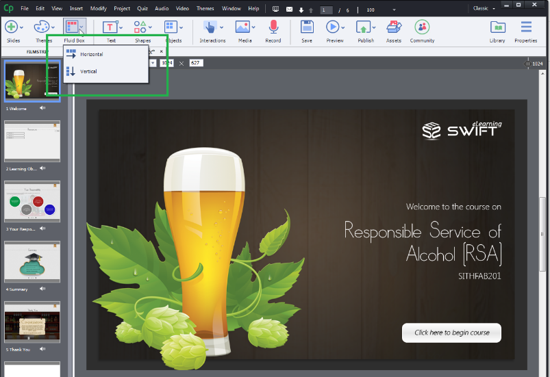
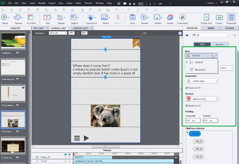
Fluid boxes, a new feature that helps to make the content responsive. The text or an object inside a fluid box, expand or shrink depending on the screen size.
You can layout the fluid boxes either horizontally or vertically. In addition, the space between the boxes distributes evenly in both horizontal and vertical layouts.
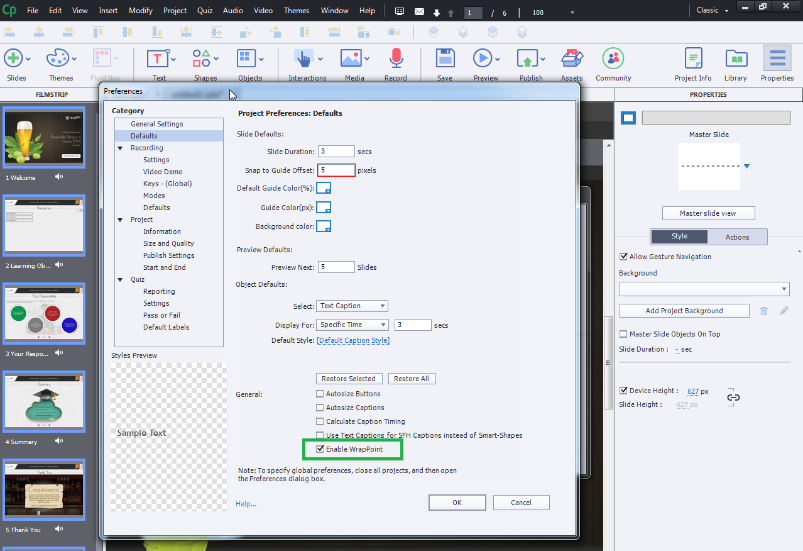
Even, you can wrap the content according to your device by enabling wrap point option in fluid boxes.
These options in fluid boxes turnout to be a time saver as it reduces the development time.
Responsive sliders:
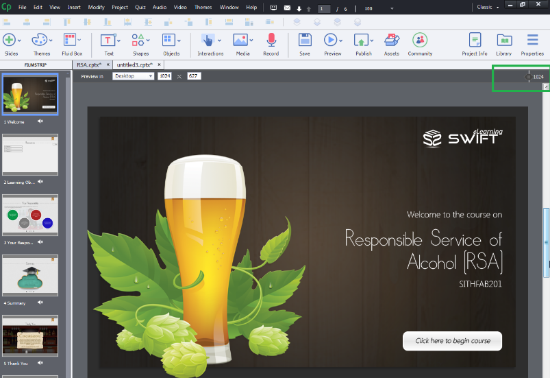
In the earlier versions of Captivate, there were breakpoints of fixed sizes to preview the courses. However, with responsive slider option, you can preview your courses in the project by sliding the slider as per your need. The dimensions of your course view will be ranging from 320 pixels to 1280 pixels width and 100 pixels to 5000 pixels height.
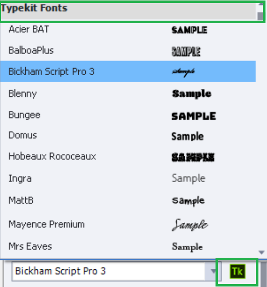
Explore font family through Adobe Typekit integration:
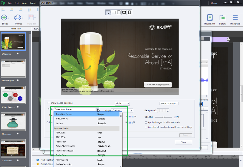
Adobe Typekit brings thousands of fonts from Typekit Marketplace to one library with a creative cloud paid subscription that gives access to browse different types of fonts to create your e-learning
projects with enriched and beautiful fonts. You can also import and use these fonts to other adobe products such as Photoshop, Illustrator, InDesign, etc.
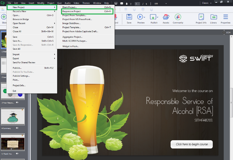
Responsive project:
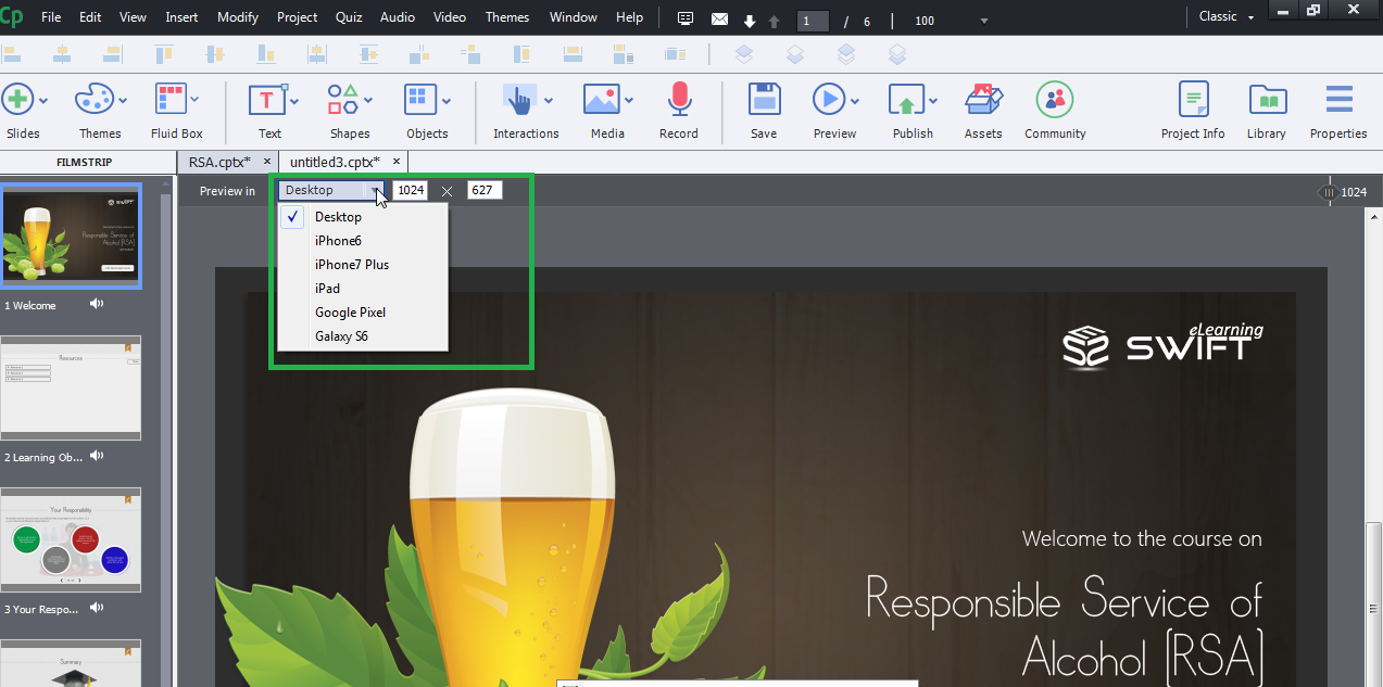
A Preview option will be available to see how a slide will look across various devices like Desktop, iPhone, iPad, etc.
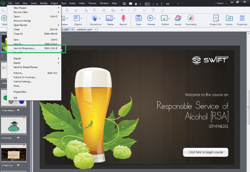
Your legacy courses will convert into responsive courses automatically once you save your course with Save As Responsive option from the File menu.
Responsive text support:
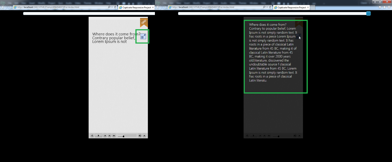
In the previous versions of Captivate, according to the screen size, probably you need to alter the text that fits exactly to the screen. However, in the latest version, Adobe Captivate 2017, added an in-built feature that automatically align the text according to the screen size. When there is lengthy text or long paragraphs in your course, then it gives learners an indication button to click, which will display the entire text in a popup window with scroll down option.
Customized Closed Captioning:
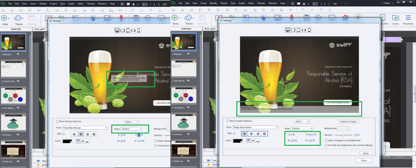
Even in earlier versions, there is CC option with certain limits. However, with the updated feature of Customized Closed Captioning you can do reposition, increase or decrease the font size, font formatting like bold or italic. Depending on the screen size and the available space, you can even adjust the position of the CC window.
You can add your own font styles with the help of Typekit fonts.
Customized preview:
In Adobe Captivate 2017, there is another feature which stands out with the other features, Preview.
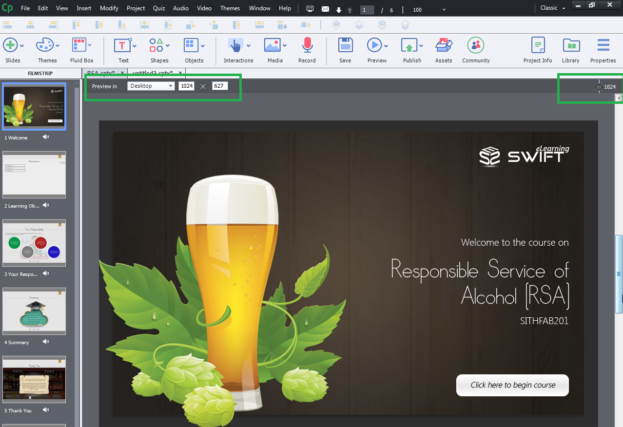
With this feature, you can preview the content in different devices from the predefined menu.
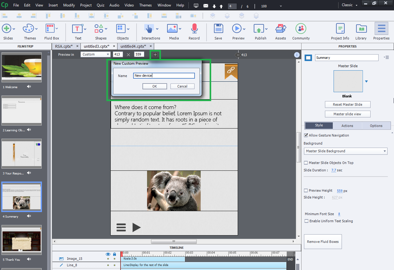
In addition to that, you can add a custom device either by giving the required width and height in the columns provided beside the preview menu or by adjusting the preview slider.
Once you add a new device to the menu, then it can be accessed from the predefined menu.
Responsive Animation Effects:
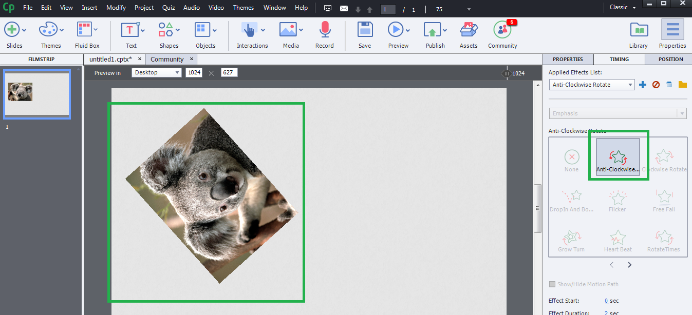
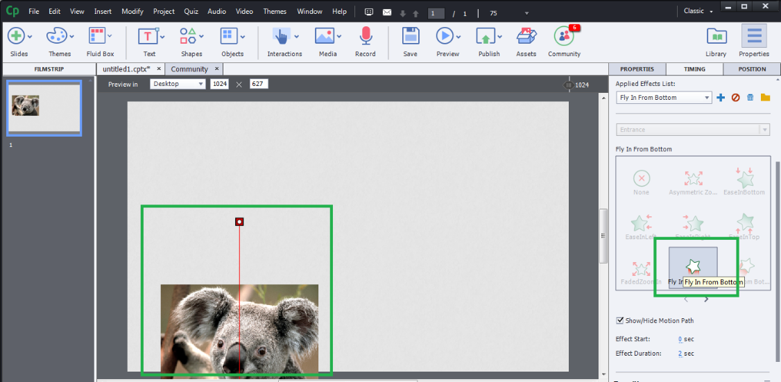
A responsive animation effect will let you know the preview of animation in your published project, when you mouse hover on to the animation in the Timing panel. You can even add custom animations using motion paths to the objects.
Hope all the features offered by Adobe Captivate 2017 make your courses more attractive, responsive and attentive to your learners.
Our Services: eLearning Solutions, eLearning Content Development, eLearning Vendor

![CP [3] | Swift eLearning Services – Custom eLearning and Digital Training Solutions cp [3]](https://www.swiftelearningservices.com/wp-content/uploads/2018/08/CP-3.jpg)

Leave a Reply
Want to join the discussion?Feel free to contribute!