Articulate Storyline Development: Introduction Screen eLearning Templates
60 seconds to catch the attention of the learner. The introduction screen is plays a vital role in any eLearning course. It may not affect the course performance, but it sets a tone for the learners’ enegement.
Introduction slide 01
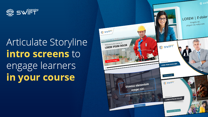
This introduction e-template is a bit different from the other templates. Here the screen is divided into a two-thirds part on the right and one-third part on the left with a curved line. The left-hand side consists of the logo placeholder, followed by the title placeholder, and lastly the tab button marked with “click here to begin the course.” The right-hand part of the interface is allotted to images, but unlike other templates, this template allows for seven different pictures of varying sizes, making the right-hand side of the interface attractive.
The vibrancy of colours seen in the seven pictures in contrast to the austere-looking left-hand side consisting of the placeholders makes the template very appealing.
The collage of seven pictures relating to the course will impart a rich feel to the template. The e-learners can straightway commence the course by clicking on the tab button.
As with many templates, this template is designed on Articulate Storyline 2 makes it computer and iPad compatible making it even more accessible to e-learners.
Introduction Slide 02
This introduction e-template is yet another simplistically designed template. A curved space is niched out of the right-hand side of the interface. This space is kept for supporting images. The left-hand side of the template has a logo placeholder and a highlighted titleholder, and below it, there is a tab button marked “click here to begin.”
Besides the picture there are bare minimum elements introduced in the template, keeping the design simple yet chaste. Once the e-learners click on the tab button, they can easily navigate to the main course.
This template is designed to Articulate Storyline 2 making it computer and iPad compatible thereby enhancing the accessibility of the course material.
Introduction Slide 03
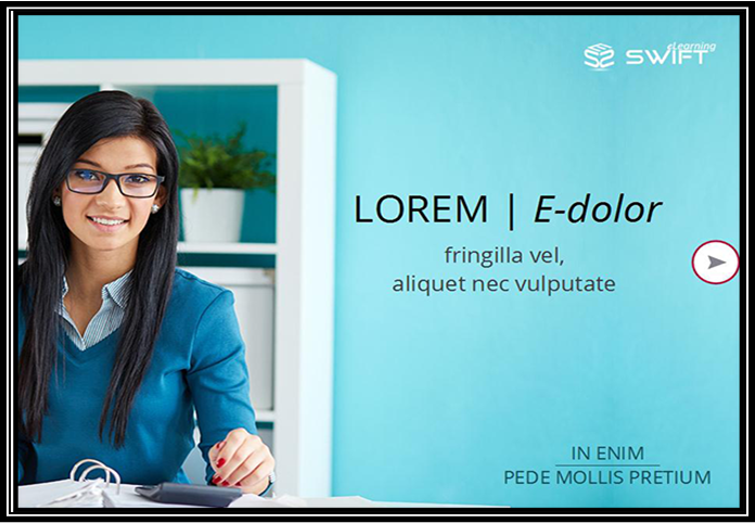
This interactive introduction e-template is also a picture based template, where the whole interface or screen is covered with a picture. On the right-hand side of the screen, there is the logo placeholder situated at the top right-hand corner of the screen. The course title with the welcome text comes next, which remains centrally positioned. There is also a text placeholder at the bottom part of the screen. Instead of a tab button, where there is a navigation button indicating the e-learners to move forward with the course.
The template has a very basic styling pattern but is aesthetically designed. In fact, replacing the tab button with a sleek navigation button enhanced the appeal of the template.
The template is based on Articulate Storyline 3 is compatible with computer, iPad and mobile.
Introduction Slide 04
This interactive introduction e-template is basically a picture based template. There is a logo placeholder on the top left-hand corner of the interface. Following it is a text placeholder merged with the words “welcome to the course on” followed by the course title. This, in turn, is followed by a red tab button with the marking “click here to begin.” There is also a play bar at the bottom of the interface.
The interface is covered entirely by a picture makes the interface appear very colourful as well as attractive. The simplicity of style coupled with the picture makes the template even more eye-catching.
By clicking on the tab button, one can start on with the course. The template is designed on Articulate Storyline 3 makes the computer, iPad, as well as mobile compatible, thereby allowing e-learners to access the course anywhere anytime.
Introduction Slide 05
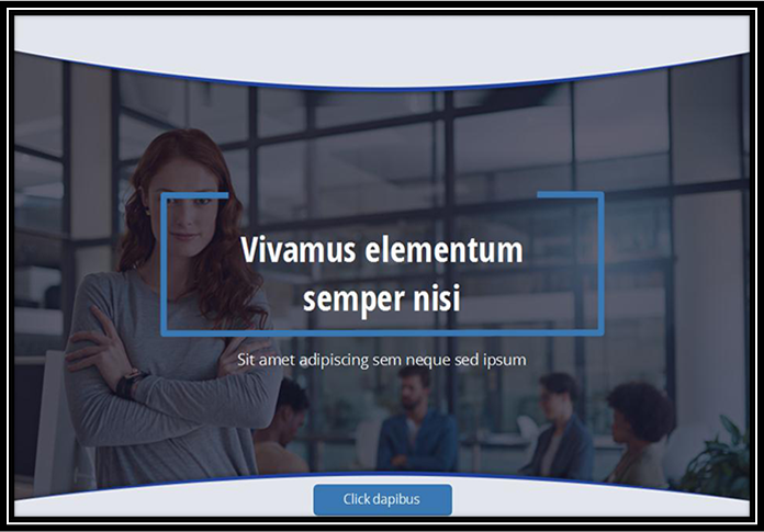
This e-template again has a very basic design. The interface shows an image visible through a darkened semitransparent screen. On the screen, centrally located is title placeholder marked with a blue border. There is a text placeholder just beneath it with the one-liner to welcome the e-learners to the course. At the bottom of the interface, centrally located in the tab button with the word “click here.”
The simplicity of design and the interplay of various shades of blue and grey make the appearance of the template very attractive. The colours blue and grey having a professional look about them and the bare minimum use of designs make the template appear very crisp and professional.
This template is also compatible with devices like computers, iPad, and mobiles making it easily accessible to e-learners.
Looking to save time and effort in e-learning course development or immediate deployment an e-Learning course? Use ready-made template collections, available for Course-Starters templates, Text and Graphic templates, Quiz templates, Video presentation templates and Interaction templates.
Our Services: eLearning Vendor, Convert PowerPoint to eLearning, eLearning Translation Services


Leave a Reply
Want to join the discussion?Feel free to contribute!