Multi-Device Elearning: Responsive eLearning Design or Adaptive – What’s the Best Choice?
With the rise of mobile devices and varied screen sizes, Responsive eLearning has become quite essential to create multi-device eLearning or mobile learning. It enables learners to access the eLearning courses from their preferred devices. As eLearning designers, we need to develop eLearning content such that it works swiftly and smoothly on every device. Before you could design mobile learning effectively, it is essential to understand the responsive as well as adaptive design principles. In our previous blog, we have discussed, “Why Responsive eLearning Design is a Must-Have for Online Training Content?” In this blog, we will discuss responsive eLearning design while comparing it with the Adaptive eLearning Design.
Responsive eLearning Design Vs Adaptive eLearning Design
Both responsive and adaptive eLearning designs are based on the web design principles. These are the two must-know facts to get started with mobile learning.
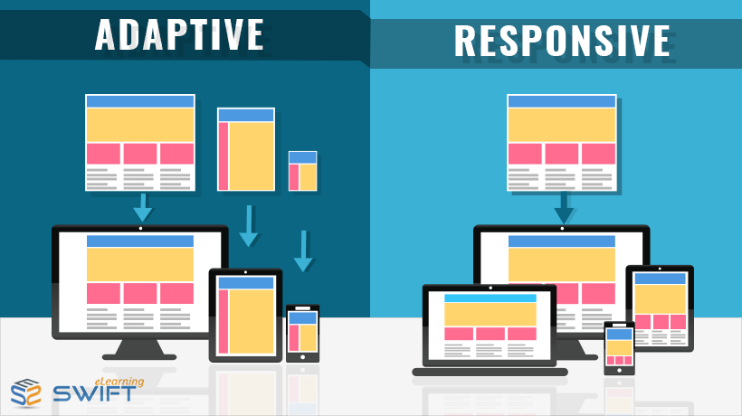
Responsive design is a web design approach in which the content responds to the particular screen size providing an optimized learning experience – No matter what the device is. Simply put, Responsive eLearning Design is the eLearning that adapts and responds to all devices.
Responsive eLearning content is fluid and flexible in nature. The content (layout and structure) restructures itself to fit the screen size depending on the learner’s device. This means you can author once and publish the eLearning content to various devices with different screen sizes.
Pros:
- Less development time and cost-effective
- Scope for customization – content can be easily updated
- Onscreen elements are resized as per the screen
- Better look and feel
- Eliminates the need to “Click Next”
Cons:
- Increased loading time (for mobile devices with inconsistent data connectivity)
- Requires more careful designing efforts
Adaptive learning design, on the other hand, is less fluid in nature and uses different layouts for different screen sizes at specific breakpoints. These layouts are predetermined and designed such that the eLearning content fits to different screen sizes. This means you have to design specific layouts for specific screen sizes.
For example, if the elearning content is to be delivered on 5 different screen sizes, then you need to create 5 different content layouts to fit those screens.
Adaptive design makes a complete sense when you are targeting eLearning delivery via particular devices.
Pros
- Provides control over design
- Less loading time – Only mobile-friendly assets are downloaded
Cons:
- Expensive and time-consuming
- Limited to specific devices
To conclude, creating responsive mobile learning courses is not just shrinking the content to fit various screen sizes, but following eLearning design principles such as maintaining user readability across all devices for better learning outcomes. Choosing the right authoring tool that provides responsive and adaptive design capabilities will be the most vital factor while designing responsive mobile learning.
At Swift, we blend the best of both worlds – Responsive as well as Adaptive for a better learner experience. Though these two terms are different, the end goal is same i.e., creating effective eLearning for a memorable learning experience. However, we believe that the learning context and the target learners should drive the device and design choice.
So what is your favourite approach in eLearning development – Responsive or Adaptive?
If you are looking for interactive eLearning course with mobile first approach, contact us for a free consultancy.
Our Services: Rapid eLearning, Custom eLearning Solutions, Flash to HTML5 Conversion


I’m so glad I came across this article. The comparison between responsive and adaptive eLearning was eye-opening. I’ve always been a bit confused about the differences, and this article clarified them perfectly. Thank you for writing this and helping me understand the distinctions better!